Portrait of King Charles III by Jonathan Yeo
By Dan Willmore
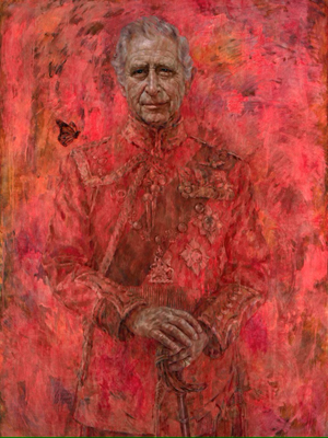 |
| This is the original version of the portrait by Jonathan Yeo. |
Recently a British organization paid Jonathan Yeo to paint a portrait of King Charles the Third. Yeo created an image which can be read in two different ways. On the one hand the image is conventional, because the painter used ordinary details and symbols. For example, King Charles said that he wanted to wear a military uniform in the painting so Yeo let him pose with the uniform that he chose, and Yeo painted the face and the hands of King Charles accurately enough that viewers can easily recognize the person in the painting. Yeo also used a conventional symbol in the painting. In this case, King Charles spent most of his life as a prince and Charles only became a king when his mother died a year or two ago, so Yeo added a figure of a monarch butterfly fluttering beside the shoulder of King Charles, at the left of the image. Yeo choose the "monarch" butterfly because King Charles is a "monarch" and because a "butterfly" is a creature which changes from a caterpillar which crawls on a stalk to a pair of wings which flies through the air the way the man in the painting himself has changed from a prince into a king. Throughout the painting Yeo made the kind of choices that most painters make for the portraits of famous people.
And then Yeo made one choice which was not ordinary at all and has become controversial. Yeo choose to flood the entire painting with a kind of neon red. Yeo painted the fabric of the coat of the king with red, and Yeo painted his brass buttons red, and Yeo painted the silver cords of his coat red too. Yeo also painted his sword red and Yeo painted the monarch butterfly red too, a flaming neon red, even though swords and monarch butterflies are not red in the real world. Yeo even went as far as to paint the background of the picture red too, so only the face and the hands of King Charles the Third are any color except red. The result is that all of the red colors in the picture seem to blur together and at last the face and the hands of King Charles the Third look like they are floating in a pool of red fluid.
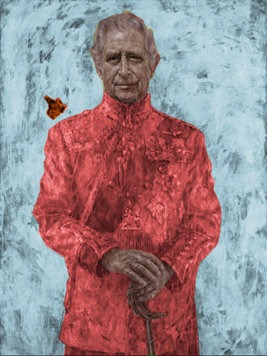 |
| Here is another version of the painting by Jonathan Yeo. I used a computer program to change the color of the background and the color of the butterfly. |
So why "red?" What does the color "red" mean? What does the color "red" mean in this picture, or what does the color "red" mean anywhere else? For most people in our society in the year 2024 the color "red" represents either "blood" or "fire", and as far as I can tell that is how most viewers have interpreted the symbolism of the color scheme of this painting. When I first saw this portrait I thought that Jonathan Yeo was pointing the finger of blame at King Charles for the history of his ancestors on the British throne. I thought that Yeo might be blaming King Charles for the slave trade in the eighteenth century, or maybe Yeo was blaming King Charles for the wars of empire in the ninteenth century and so forth. After that I went to the world wide web and I found that a lot of people were saying much the same thing. Some people said that the new painting looked like a poster for an old vampire movie from the middle of the last century, with King Charles marching like Dracula from a curtain of blood, while others said that the portrait looked like Yeo was trying to put King Charles in a sheet of fire after his soul was judged by Karl Marx and sent to pay reparations in the afterlife.
For most people in our society in the year 2024 the color "red" represents either "blood" or "fire."
I will be the first to admit that a minority of voices on the world wide web like Yeo's portrait of King Charles. These writers praise the symbolism of the butterfly. These writers also say that Yeo is also good at showing how heavy and flabby the fingers of King Charles are and how well these senile digits show the age and bad health of the subject. And these writers say that the flaming red color makes this portrait look different from other portraits.
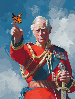 |
| Here is another picture of the king and the butterfly. I used a computer program to create this image. |
I will be the first to agree that this portrait is very different from other portraits because other painters rarely flood their subjects with red. In fact, Jonathan Yeo almost never floods his subjects with red, either, and that is easy to prove. Yeo himself has a website where he uploads images of the portraits that he has made. Readers can see the page at
Jonathan Yeo Paintings Copyright © 2024 Jonathan Yeo https://www.jonathanyeo.com/paintings
That page has eighty-seven portraits. This set includes portraits of world leaders and this set includes portraits of children and this set includes portraits of architects who died generations ago. This set includes portraits of pregnant women with no clothes on and this set includes portraits of social activists. Many of these images have traces of red, as well as blue backgrounds and beige and purple and even pink backgrounds; but only three of these images are flooded with red from side to side.
I looked at the three images carefully, and I invite everyone else to look at the site and look at the three paintings with red backgrounds too. One is a picture of a British soldier who fought at the liberation of Normandy, and the second is a picture of an American actor who became famous for playing gangsters and evil knights from outer space; and the third is the portrait of King Charles the Third. Off the top of my head, I might guess that Yeo put the red in the painting of the soldier to represent the dead of the war, and I think Yeo put the red in the painting of the actor to represent the violence of modern movies. I feel confident that everyone will agree that Yeo keeps the deepest and most fiery pool of red for his portrait of King Charles the Third.
What does this red represent? I clicked on the image for the portrait of King Charles himself, and I found Yeo's own explanation. I am offering it below.
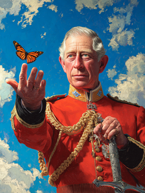 |
| Here is another picture of the king and the butterfly. I used a computer program to create this image. |
I quote:
"The vivid colour of the glazes in the background echo the uniforms bright red tunic, not only resonating with the royal heritage found in many historical portraits but also injecting a dynamic, contemporary jolt into the genre with its uniformly powerful hue / providing a modern contrast to more traditional depictions. "
Unquote.
I read those words carefully, and I will be the first to admit that the artist offered a good defense of the color "red." I think that Yeo has defended the color "red" about as well as the color "red" can be defended, if somebody wanted to defend the color "red" in the abstract. At the same time, I would expect that most readers could also offer good defenses for other colors too, such as the color "green" and the color "blue" as well. However, tossing around empty words like "dynamic" and "contemporary" does not explain why drowning a subject in fire and blood is more "modern" than "traditional."
In this case I think Jonathan Yeo choose the color "red" precisely because the color "red" makes most people think about "blood" or "fire", and this painter wanted to have it both ways. Yeo wanted to get money from a rich client while at the same time Yeo wanted his friends on the left to think that Yeo was still politically correct. Flooding the picture with red allowed Yeo to create a picture which had a hidden meaning, like a fish hook in a marshmallow. I think that Yeo took money from his client and then Yeo created a portrait which made his subject look like a bad guy because Yeo thought that his subject was too stupid to figure the trick out and because Yeo thought that his subject was too weak to do anything about the trick even if his subject did figure the trick out, or if somebody else figured the trick out and then explained the stunt to his subject.
Anyway, I did some thinking about the colors in this image, and then I decided to find out what the picture would look like with a different approach. I downloaded the file and I pulled the image into the Adobe Photoshop application. I then changed the colors of the portrait. I started by converting the background into blue, and then I changed the butterfly into orange because that is the color of real monarch butterfly, and so it would show up better against the background. You can see the "new" version of Yeo's painting on this page. I hope that the new combination is just as "dynamic" and "contemporary" as anyone should want without looking murderous at the same time. I will be the first to admit that other people might choose a different or even a better set of colors, but I hope we all agree that any set of colors would be kinder to the subject than a puddle of blood on fire.
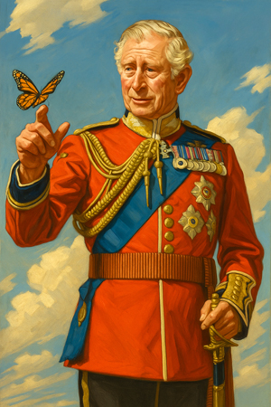 |
| Here is another picture of the king and the butterfly. I used a computer program to create this image. |
The new technologies have made other approaches possible. Recently I went to the internet and I used several computer programs to create new images with the same subjects. If you look on this page, you can see three more versions of King Charles III wearing the same uniform and interacting with a monarch butterfly. I know that some people hate the very idea of making pictures with a computer, but I have found that "artificial intelligence" actually helps me show other people what I imagine, and I find that I can do a lot of things with the new "AI" programs that I was not able to do before.
Now that I have said all that, I hope I have not been too hard on Jonathan Yeo. Modern art is full of the kind of tricks that Yeo tried to pull. Jonathan Yeo is far from the only person to try a stunt like this, and this is far from the most obvious trick that I have seen in recent years. Having said that, I felt like making a few comments, and so I did.
Copyright 2024 Dan Willmore